Portfolio Design Iterations / Hero Carousel
Hero Carousel
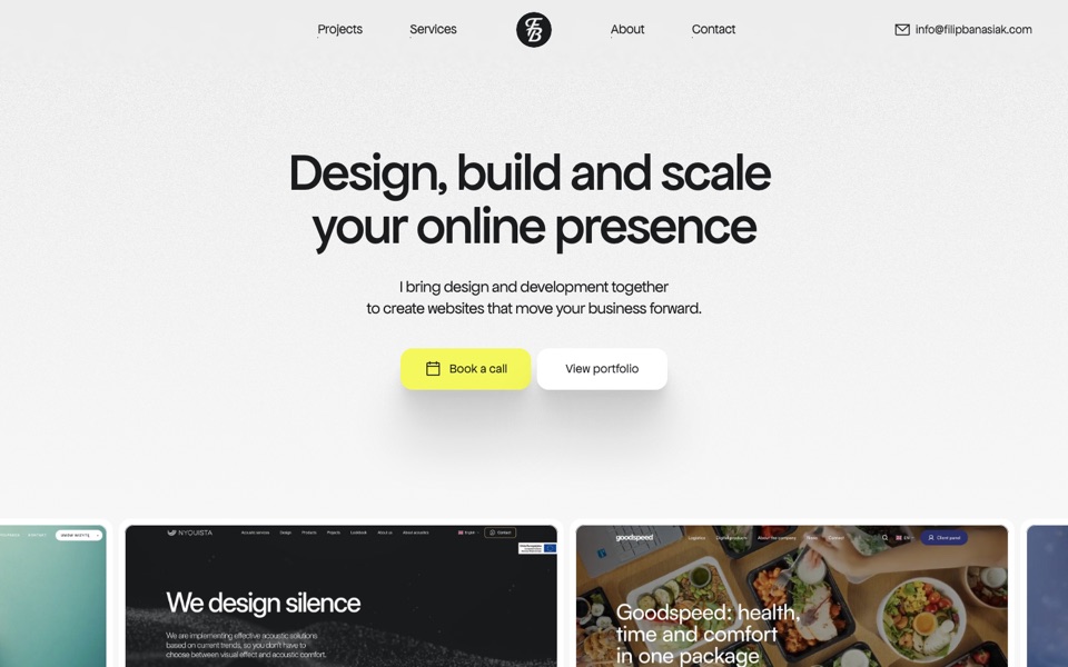
The live home page with the project cards under the hero moved from BetterCarousel to smooothy. Same cards and geometry as live (first card at 160 px, 600 px cards, 8 px gap); only the slider changes. Drag with the mouse or swipe; focus the row and use ← →. Desktop and tablet only — the phone layout has no carousel.
Middle card 1.5×
v1.3 with a stronger focus: the card in the middle is 600 px and the others 400 px, so it is half as big again. The smaller cards close up to it, keeping the 8 px gap while they grow and shrink.
Open version
Focus in the middle
v1.1 with the snapped card in the middle of the window instead of at 160 px. That card is full size; the others shrink to 84% and grow back as they slide into the middle. The row starts and ends with a card in the middle.
Open version
Focus on the first card
v1.1 where the card at 160 px is full size and the others are 84%, growing as they slide into its place. At the end of the row the last card never reaches 160 px, so it stays small.
Open version
Smooth snap, no loop
v1 with two ends, like the live carousel: nothing to the left of the first card, and the row stops when the last card meets the right edge of the window. Pulling past either end gives a little and springs back.
Open version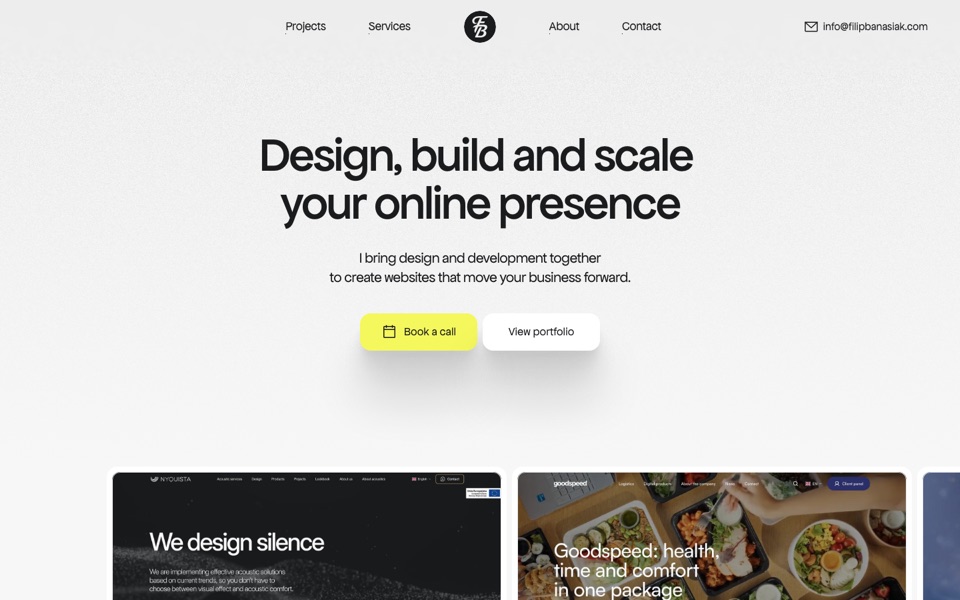
Free scroll
No snap: the row glides and slows down on its own, with a heavier ease. A trackpad or mouse wheel scrolls it sideways too.
Open version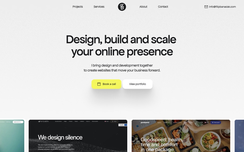
Speed squeeze
Cards shrink a little while the row moves fast and settle back to full size when it stops. The amount follows the slider’s speed, smoothed.
Open version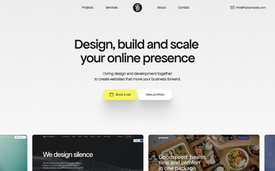
Parallax
The video in each card drifts against its frame as the card crosses the window, up to 8% either way. The frames stay put; only what is inside them moves.
Open version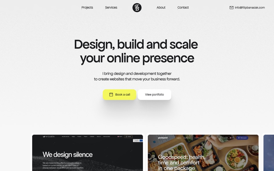
Smooth snap
smooothy with its defaults: the row follows the drag with easing, snaps to a card and loops without end, so the last card peeks in on the left.
Open version